Toronto’s First Post Office (TFPO) Museum
Collaborated with TFPO to redesign their website to improve the accessibility, information hierarchy and navigation.

Team Members:
Andrea Gonzalez, Rebecca Hsiung, Runjie Dai, Yanch Ong
Role:
User Research, Usability Testing, Wireframed Low Fidelity Flows, Prototyped Medium Fidelity Flows, Ideation
Duration:
4 months (Jan 2024- Apr 2024)
Client:
Toronto’s First Post Office Museum
Problem:
The First Post Office Museum was looking to re-design the user interface of the First Post Office Museum website, and improve the content, navigation and accessibility of the Learning and Resources section, with a particular focus on the following pages: Collections & Archives, Museum from Home, and Virtual Exhibits.
In the current state, the client felt that the site’s navigation is unclear to users, the virtual exhibits lack accessibility features, and the current design is not aligned with user needs.
Solution:
We redesigned the website for Toronto’s First Post Office Museum (TFPO) to improve its overall user experience, focusing on enhancing information architecture, hierarchy, density, and accessibility. Our goal was to engage visitors interested in Toronto’s rich local history while making it easier for them to plan a visit.
The redesign prioritized inclusivity and accessibility, aiming to raise awareness of the museum. By improving user engagement and overall usability, we sought to attract a wider audience and strengthen the museum’s presence within the community.
USER RESEARCH
To better understand the problem space, we conducted a mixed-methods research approach that included surveys, semi-structured interviews, and think-aloud observations. Surveys allowed us to quickly gather insights from a broad group of participants, including community members and museum-goers. From these surveys, we identified candidates interested in participating in more in-depth interviews.
The semi-structured interviews, combined with think-aloud observations, enabled us to explore user experiences in greater detail. By observing participants as they interacted with the website and asking follow-up questions, we were able to uncover deeper insights into navigation issues, accessibility barriers, and other pain points that informed our proposed solutions for the website.
We interviewed 14 participants including:
2
Museum Coordinators
7
General Museum Goers
1
TFPO’s Postal Store Clerk
3
TFPO Community Members
1
Board of Directors Member
RESEARCH ANALYSIS
To analyze our primary data from interviews, we conducted thematic analysis and inductively coded participant comments to identify emerging themes and patterns. We transcribed the audio and organized the overarching and recurring themes and pain points into an affinity diagram. Using the affinity diagram, we identified various recurring patterns in the interviewee’s experiences and prioritized clusters based on how frequently we heard themes come up across the user groups. Furthermore, clusters of pain points were also prioritized based on the impact on the user, or the extent to which the user was prevented from completing tasks on the website.
User Insights:
Navigation
Users struggled to find information on upcoming events and exhibits due to ambiguous and unintuitive labeling, leading to frustration and a trial-and-error approach to navigation. For example the users couldn’t find virtual tours easily and ‘dropped off’.
Interactivity and responsiveness
Users were dissatisfied with the digital exhibits' lack of interactivity, which hindered engagement and failed to capture their curiosity about the exhibition's narrative. The exhibits had long blocks of text with very few images or interactive elements.
Information hierarchy
Users found the information hierarchy and density overwhelming, particularly in the virtual exhibits, and expressed a need for improved access to information for more effective engagement. For example, the text heavy virtual exhibits, users do not want to read through.
Consistency
Users reported inconsistencies in website design, including unclear navigation labels, layout, color use, and unexpected redirections to external sites or PDFs without warning. Some of the buttons on the website were not consistent. For example, SHOP was in all caps as opposed to the other menu items.
Accessibility
Users were concerned about the website's poor color contrast, which made it difficult to see clickable icons and links due to insufficient contrast between foreground and background colors. There weren’t any accessibility options while reading large blocks of text.
Problem Statement
When browsing the TFPO museum website, users struggle to understand what the museum offers, and they get lost easily and feel overwhelmed browsing through the virtual exhibits.
How might we redesign the TFPO museum website to attract and engage museum goers, encourage them to go in person and foster a sense of connection to the institution?
Persona
We created the persona Amma to help us empathize with museum-goers' experiences, ensuring that every design decision was rooted in our research findings.

As- Is Scenario
We developed a customer journey map to align all stakeholders on the current user experience. This helped identify key pain points throughout the process.

IDEATION & USABILITY TESTING
We brainstormed a range of solutions to address the pain points uncovered in our research. As a team, prioritized ideas that were both highly feasible and impactful to ensure we could deliver the best product within the limited timeframe.
To get user insights on our proposed solution, we worked on a medium fidelity prototype for some of the webpages. Further to this, we conducted usability testing on the medium fidelity prototypes. We conducted the usability test with 5 museum goers, and we tested for the accessibility settings, information architecture and navigation.

Mid-Fidelity prototype:
Users did not understand ‘TYHS Newsletters’ and wanted a distinction between exhibits and events. Users felt ‘educator’ did not encompass the contents of the dropdown menu.

Mid-Fidelity prototype:
Users felt that the text on the image was hard to read and the ‘Photo gallery’ button did not fit well.

Mid-Fidelity prototype:
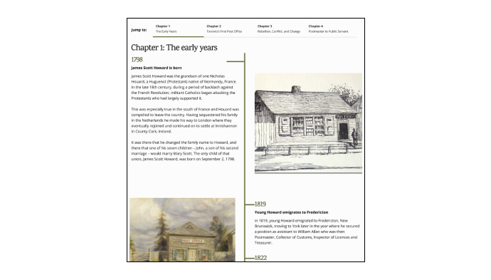
Users felt that the side navigation bar was far from the text and was easy to miss. It was static so had to scroll up to move through sections. They did not understand that each paragraph was a ‘year’ in the side navigation bar.
Final Prototype

Final prototype:
Changed the label to ‘Newsletters’ and separated exhibits and events. To better encompass the contents, we changed the menu item to ‘Teach’.

Final prototype:
Moved the text from the image as a title instead and moved the accessibility button up as well. We removed the photo gallery button.
Final prototype:
We removed the side navigation bar and used chapters that were dynamic at the top of the article. Added a heading of the year above each paragraph and made the article more interactive.


TFPO redesigned Homepage and Plan Your Visit page
TFPO’s Exhibits pages
KEY TAKEAWAYS
Consistent Communication
Over the course of the project, I learnt a lot about working with people from various backgrounds and skillsets. I always shared my thoughts with the group and made sure I listen to their thoughts and ideas as well.
Open to Ambiguity
I learned that the process of creating the app and UXD is not linear, there are lots of iterations and areas of ambiguity. As a result, I was able to pivot and come up with new ideas and think beyond what I thought I knew.
Phrasing my Ideas in Short Sentences
While doing interviews during user research, I used to talk more than required. Over the course of the project, I learned to be more succinct which is key in UXD.